


Creating a layered color font
With Glyphs, creating layered color fonts is a snap. Find out how.

In essence, layer fonts are several separate fonts, that need to be placed exactly on top of each other by the user. Each of the layers has the same position, the same text, but a different color.
Setting up axis, masters and instances
After you created a new font file, you need to add a new axis in File > Font Info > Font > Axes. Call it Color and as tag, use something like COLR (all-caps, four letters, A-Z only):

Remember: masters are what you draw, instances are the font files you export.
Now let’s think logically: it is clear that we need one master per color layer, and we need to export the masters exactly as they are as instances. So, we need to keep masters and instances in sync. And: we do not need to interpolate, so the masters do not need to be compatible. That is why we add a custom parameter called Enforce Compatibility Check in Font Info > Font > Custom Parameters and turn its value off (the second checkbox):

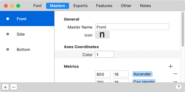
Let’s stay in the File > Font Info window, but switch to the Masters tab. For each color layer you need, add a new master there. Make sure you give each of them a different name and axis coordinate, e.g., ‘Front’, ‘Side’, ‘Bottom’, and 1, 2, and 3, like this:
And, while we are at it, you can assign different preview colors to your master layers. That is because layer fonts are no fun if all the layers have the same color. This is how you do it: add a new custom parameter called Master Color (you can do this for all selected masters at once), and in the Value field, a color swatch will appear. Click on the swatch to pick a different color:

Hint, hint: You can even choose a transparency, which is handy if you want to simulate an overprint effect.
When you are done, select the Master Color parameter, and copy it to the clipboard (Cmd-C). Then select all the other masters and paste (Cmd-V). Then you can conveniently click on the swatch and change the color for each layer.
Now, in the Font Info window, switch to the Exports tab. There, you create instances with the exact same axis values we used before in our masters. To do that, click on the Plus button in the bottom left, and choose Add Instance for each Master from the menu that pops up:

Using the exact same values makes sure we are not interpolating. That is good because we do not want to interpolate, we just want to draw and export different layers.
Editing the layer glyphs
Once you close the Font Info window, you are taken back to the Font window. Let’s double click the uppercase I, an easy letter, ideal for experimenting and trying some editing.
Using the Master buttons at the top of the window, or the shortcuts Cmd-1, Cmd-2, and Cmd-3, you can switch between the layers. In the Layers palette in the sidebar on the right (Cmd-Opt-P), our custom names show up: ‘Front’, ‘Side’, ‘Bottom’. To the left of each layer name, there is a little eye symbol. Click on all closed eyes to open them. So, all master layers are displayed at once while you edit them:

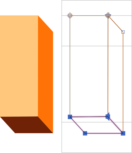
Press Cmd-1 to go to the ‘Front’ layer, and draw a rectangle from the cap height to the baseline, for the uppercase I:

Then, while the rectangle is still selected, copy it to the clipboard (Cmd-C), switch to the ‘Side’ layer (Cmd-2), and paste (Cmd-V). Select the two leftmost nodes with the Select tool (V), and move them to the bottom right, like this:

Select all (Cmd-A), copy to the clipboard (Cmd-C), switch to the ‘Bottom’ layer (Cmd-3), and paste. Now move the two top nodes to the bottom left position, so that the top of the ‘Bottom’ layer aligns with the base of the ‘Front’ layer:

Now is a good time to hold down your Option key, and choose Correct Path Direction for All Masters (Cmd-Opt-Shift-R) from the Paths menu. Hold down the space bar to temporarily see a Preview, or simply switch to the Text tool (T), and you can see if everything works out as expected:

Congratulations, you have your first layered glyph.
Editing multiple layers
Speaking of editing, there is a Select All Layers tool, which allows you to edit any points on any visible layer. You can reach it by pressing Shift-V (repeatedly until the double arrow symbol shows up in the tool icon), or clicking and holding the Select tool icon, and choosing it from the pop-up that appears:

It will allow you to simultaneously edit paths on multiple layers, as long as the layers are active in the Layers palette. An active layer has an open eye symbol. A closed eye symbol means that the layer is protected from edits. While the Select All Layers tool is active, shapes are displayed in the respective master colors we defined before in File > Font Info > Masters:
Most menu commands work for all layers at once if you hold down the Option key while opening the menus. You can, for instance, choose Glyph > Update Metrics for All Masters (Cmd-Opt-Ctrl-M) and we have already used Paths > Correct Path Direction for All Masters (Cmd-Opt-Shift-R).
Keeping metrics and kerning in sync
Another big issue: keeping all the widths the same in all masters. After all, if a width is changed in one color, all the other color layers must follow too. You could of course always go through all masters with Cmd-1, 2, 3 etc., and do the same metric change everywhere. But there is a smarter way.
In File > Font Info > Masters (Cmd-I), add the custom parameter Link Metrics With First Master to all masters. Technically, you would not need to add it to the first one, but it doesn’t hurt to add them to the first one too, which may save you some headache just in case you reorder your masters later. Now, all width changes are kept in sync throughout all masters that have this parameter. And not only the width changes, but also all kerning changes are kept in sync between all masters. Cool.
Sometimes you do not want to link metrics and kerning with the first master, but with another master. In these cases, you can use the Link Metrics with Master parameter. As parameter value, pick the master you want to link to:

Useful filters and scripts
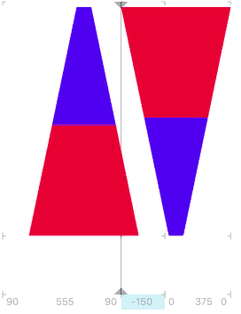
Okay, I admit the uppercase I was very easy. If you have more complex shapes, you can get some help from Filter > Extrude:

The filter provides a good start. By smartly cutting up the shapes you receive, and distributing them onto the respective layers, you can get pretty far:

Of course, you may have other things in mind, not just 3D extrusions. Filter > Offset Curve, as well as Round Corners and Hatch Outline (or any combination of them) can help derive new shapes for other layers from an original shape. Also, it is a good idea to take a peek into Window > Plugin Manager, both among the plug-ins and the scripts, and see if you can find something helpful for your project there.
In case you want to create shadows for one or more of your layers, you have a couple of options available to you in Window > Plugin Manager. The Harbor Type Scripts contain Make Block Shadow, and Kyle Wayne Benson’s Scripts have multiple scripts for creating all kinds of different shadows.
The mekkablue script collection contains a script called Color Fonts > Convert Layerfont to CPAL+COLR. It rearranges your layer font setup to a CPAL/COLR font setup with a color palette and true color layers. Read more about CPAL/COLR fonts (a.k.a. Microsoft color fonts) in the respective tutorial.
Applying layer fonts in InDesign
You export the fonts just as you would in any other font project. As always, it is a good idea to use the Adobe Fonts folder.
Now, what you need to do in InDesign, is to have multiple text frames with the exact same content exactly on top of each other, each of them with a different font style. You can use InDesign’s place-and-link tool to achieve that.
Hint: if the layers do not align even though the text boxes are exactly on top of each other, consider a different method for setting the first baseline offset in the respective text boxes. Needless to say, make sure all stacked text boxes have the same settings.
Layering fonts in Illustrator
There is one problem with aligning area type objects (i.e., text in text boxes) in Adobe Illustrator. By default, the app tries to be smart about finding a good offset for the first baseline in your text box. To do that, Illustrator measures your lowercase letter d, and uses its ascender height as offset for the first line. I am not kidding, AI really does that.
The problem is that, in the color layers, it is rather unlikely for all of them to happen to have the same vertical maximum in the lowercase d. So, as a consequence, the layers will not align, and you may receive a large number of support requests by e-mail from the people who bought your color font.
There are two things you can do. Firstly, you can try to educate your customers about how to change the baseline offset setting for all area type objects in Adobe Illustrator: Select all text boxes you want to align, go to Type > Area Type Options, and choose Fixed or Leading as the First Baseline option. Keep in mind though, that even experienced users often do not know about this setting. And you risk that they publish an angry Instagram posting about your font before they contact you.
Or, secondly, you can add a tiny square, maybe just one unit wide, at the top of all layers in your lowercase d. Copy and paste it at the same height in all color layers, and make sure it is the highest path object in this letter. Make sure you find a good spot in your design, so it does not show too much. Then, when Illustrator measures your lowercase d, it will find all of them to be of the same height, and align them all by default. And your inbox will not overfill with support requests.
And again, also for testing the font in AI, make sure you use the Adobe Fonts folder.
Sample font: Sapperlot
In any event, you can do pretty good stuff with this, like Thomas Maier (DrTypo) did with his font Sapperlot. Thomas open-sourced the .glyphs file, so head on over to his GitHub page and take a closer look:

SAMPLE FONT : SAPPERLOT, COURTESY OF THOMAS MAIER.
Update 2014-12-24: added the paragraphs about layering fonts in Illustrator.
Update 2016-11-30: added the paragraphs about the Link Metrics with First Master parameter.
Update 2016-12-01: fixed typos and modification date.
Update 2017-01-18: added paragraph and screenshot for Link Metrics with Master
Update 2021-07-08: updates for Glyphs 3.


