Additional masters for individual glyphs: the brace trick in Glyphs 2
Sometimes you need an extra master, but just for a glyph, not for the whole font. Here is how you do it in Glyphs 2.
For interpolation, two-master setups work surprisingly well. Well, except that sometimes you need an extra step in between. Sure, you could sort of fake it with the Bracket Trick, or an alternative glyph that kicks in in some instances only. But that can turn out to be complicated, as we may have to add (and redraw) many masters per glyph.
Create and name a brace layer
In Glyphs 2, you can employ something called the ‘brace trick’. Similar to the bracket trick, we copy one of the master layers, and adjust the name. You do that by opening the Palette sidebar (Window > Palette, Cmd-Opt-P), selecting your first master in the Layers palette, and clicking the Copy button.
Double click the name of the new layer, and type in a brace layer name. The name structure is as follows:
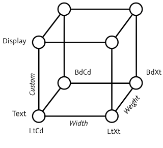
optionalDescription {weightValue, widthValue}In short, it is curly braces containing a comma-separated list of interpolation values. If you like, you can use a descriptive prefix such as ‘Intermediate’. What it does is insert an intermediate master for this very glyph at that very position in the interpolation space. For instance, a layer called Intermediate {120, 100} will act as a master at 120 on the weight axis, and at 100 on the width axis.
All that rests to be done now, is actually draw the layer. You can get a head start if you choose Re-Interpolate from the gear menu in the bottom right of the Layers palette. This will put a new interpolation into the brace layer. Careful, it overwrites what is there.

By the way, you can temporarily deactivate the brace layer by deleting a curly brace or writing a suffix between braces, e.g. Intermediate {90, 100 off}. You can check if the layer is active or inactive by choosing Show all instances from the instance pop-up in the Preview section of the Edit tab.
Example
A typical use case would be the lowercase e, interpolating from Light to Heavy. While the stems can increase equally up until a medium weight, the horizontals cannot grow as quickly as the verticals in heavier weights. If we just have a Light and a Bold master, the horizontals thin out too soon. Pay attention to the middle bar of the e:

We can fix the wacky interpolations with an intermediate master for this glyph. Like described above, we add a brace layer with a sensible descriptive name and an appropriate weight value. We can leave the width value at its default. So, in our example, this happens to be Intermediate {90, 100}:

Now you have an extra master, just for this glyph, and the e interpolates much better. Look how well the middle bar behaves, while the outer masters remain the same:

That’s it. High five.
Update 2022-07-19: updated title, related articles, minor formatting.
Update 2024-06-12: added link to ‘Intermediate layers’ tutorial.