Positioning with number values
You can now define number values in font masters. They interpolate and can be used as variables in OpenType feature code.
Say you want to solve the problem of parentheses for all-cap typesetting. Easy, you would put that into the case feature. Though, you find that you would not want to do it with alternate glyphs like parenleft.case and parenright.case, because the shapes of your parentheses are just fine for both upper- and lowercase. They just need to be shifted into the right spot. Solution: do it with a positioning adjustment. ‘Hold your horses’, I hear you say, ‘what is a positioning adjustment?’
Substitution vs. positioning
In principle, there are two kinds of rules possible in an OpenType feature, substitutions and positionings. Either way, you will define them in a feature in File > Font Info > Features. When the font is compiled, substituting rules end up in an OpenType table called GSUB, which is short for glyph substitution, and positioning code goes into GPOS, short for glyph positioning.
In feature code, a substitution rule would look like this:
sub parenleft by parenleft.case;…which substitutes a glyph called parenleft for an alternate glyph called parenleft.case. Typically, the suffix stands for the OpenType feature it is meant for. In this case, case refers to the Case-Sensitive Forms feature, which ‘shifts various punctuation marks up to a position that works better with all-capital sequences or sets of lining figures.’ In the above example, the shifting is done by replacing one version of the parenthesis with another.
In contrast, a glyph positioning rule in the same feature would look like this:
pos parenleft <10 40 20 0>;It moves the parenleft glyph up by 40 units, and pads it with 10 extra units on either side.
To explain: according to the AFDKO specification (in which the syntax for this kind of feature code is defined), this is called a single adjustment positioning. The structure between < and > is called a value record and consists of 4 numbers. The first two are the x and y placement adjustment, which means the shifting of the image of the left parenthesis. In our case, the parenthesis moves 10 units to the right and 40 units up.
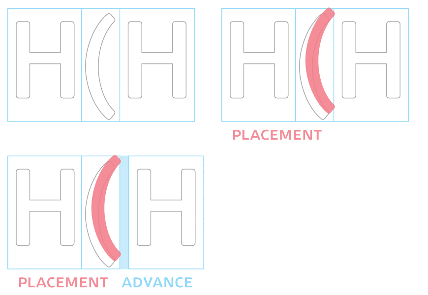
Moving the parenthesis to the right means we need more space on the right edge as well, because otherwise we might crash into the cap that follows. That is why we have a third and fourth number: the x and y advance adjustment, which refers to the position of the cursor after the parenthesis, or the place where the following glyph would connect. If we want to pad the parenthesis with 10 extra units on the left and 10 extra units on the right, the cursor after the parenthesis and thus the following glyphs must move to the right by (10+10=) 20 units. Or in other words, the advance is increased by 20 units. The fourth number is zero because we want the following glyphs to stay on the same line, of course.
The advantage of the positioning solution is clear: you do not need to manage additional glyphs, which may get out of sync otherwise. One source of error less. Of course, the disadvantage is also clear: you can only use the pos solution if the design allows it in the first place. Simply put, you can just move the parenthesis around, you cannot adapt its shape with this method.
Classes
Needless to say, you would not only do that for the left parenthesis, but also for the right one, and for braces and brackets too, so the line would look like this:
pos [parenleft parenright bracketleft bracketright braceleft braceright] <10 40 20 0>;When you put multiple glyph names between square brackets like this, it is called an ‘OpenType class’. You can also define a class and give it a name, especially if you want to reuse it later, in a different feature:
@brackets = [parenleft parenright bracketleft bracketright braceleft braceright];
pos @brackets <10 40 20 0>;
You see, to differentiate them from mere glyph names, class names start with an at sign (@). Now, one more twist: you can set up the same class in the UI of the Font Info > Features window:
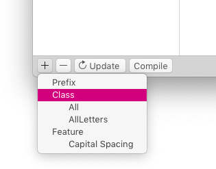
… and add your class code there:
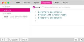
This means only the pos line needs to remain in the case feature:
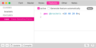
To verify if you have done everything right, click on on the Compile button. If you do not get an error message, you’re good. If you do get an error message, try to make sense of what it says. The code editor will assist you in correcting any mistakes that may be hiding in the code.
Number values
Say you have a design where the positioning solution is an option, but it turns out that you would need to shift it up 40 units in the light master, but you only need a shift of 20 units in the bold master. That means that the code we entered here would be good for lighter styles, but not good enough for styles at the opposite end of the weight spectrum.
Enter Numbers. In File > Font Info > Masters > Numbers, you can define variables and give them a name. The good thing? Once you define such a number, they appear in all masters. Needless to say, in every master you can give them different values. And needless to say, the values get interpolated nicely to what we want to have.
So let’s add a number, call it parenthesisshift, and give it a value of 40 in the light master:
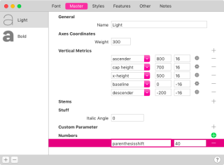
… and change its value to 20 in the Bold master.
So far so good. But how do we get that number into our feature code? Easy: with a $ prefix! Our case feature code will now look like this:
pos @brackets <10 $parenthesisshift 20 0>;So, our Font Info > Features window will look more or less like this:
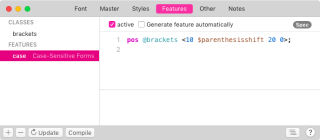
Now, when we export our font styles, the code will be written out with the appropriate interpolation of the number, and the parenthesis will always shift to the right place in each style. Cool.
Calculations
So far, so good. But what about the horizontal placement and advance figures? We can easily introduce a new number in Font Info > Masters > Number Values and call it cappadding. So, in the bold master, we write, for instance:

Typically, that number will be smaller in bold weights, and bigger in light weights. That is because a little bit of extra white is a lot in a bold weight, where there is little white to start with. The same amount of extra white would be negligible in a light weight, which already has a lot of white. So, for the extra padding to be visible in a light weight, it needs to be more. Therefore, we set a higher value in the light master:

Remember that the advance needs to be twice as much as the placement value if you want to pad evenly left and right. So we cannot just (re)use the number, but need to multiply it with two. How do we do that? Easy, with a calculation:
pos @brackets <$cappadding $parenthesisshift ${cappadding*2} 0>;For a calculation inside the OpenType feature syntax, we start with a dollar sign $ and write the calculation between curly braces: ${...}. If we want double cappadding, we simply write ${cappadding*2}:
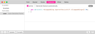
That’s all that there is to it. All number names are available, just like any number and the basic math operations: +and - for addition and subtraction, * and / for multiplication and division. Everything between curly braces will be calculated for each individual font style according to its interpolation.
Update-03-08-06: minor formatting changes.


